On Twitter, Stocktwits and sites like Zerohedge you keep seeing messages contending that debt is getting too high and thus the US economy must be on its way to another collapse. Not rarely you will see this kind of “news” backed up with data and charts taken straight from the Fed’s FRED website (https://fred.stlouisfed.org/). The problem is that many people don’t know (or don’t want to know) when to use a semi-log scale on a chart. They also don’t know how to make better use of the FRED site. In this article I will give a few examples how to make better use of this resource.
Today I saw this chart on Twitter with the comment that consumer credit has started exploding since the gold standard was abandoned in 1971: https://fred.stlouisfed.org/series/TOTALSL
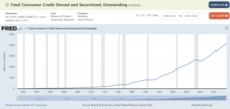
Well, it sure looks like it started going up faster and faster around 1971. I wouldn’t blame any person to conclude that debt is exploding when they see this chart. But a nominal chart over a 70 year period cannot properly show whether debt is exploding or not. There are a few easy ways to fix that by using the orange “Edit Graph” button in the top right.
After clicking that button we see this. By changing the “units” to “Percent change from year ago” we get much more useful chart showing how quickly or slowly consumer credit went up (or down) since WW2:

We can see that consumer credit was growing fast in the 50s, 60s and 70s, with a typical slowdown around recessions. The last 15 years we see relatively slow consumer credit growth on a YoY basis. The nominal chart we saw at the start of this article did not show us that kind of details.
Another way to get a more useful view is by changing the display to semi-log scale. Starting from the first nominal chart we again click the “Edit Graph” button and now we go to the “Format” tab where we can switch to log scale:

What we see here is consistent with what we discovered in the second chart. Consumer credit showed steep growth after WW2 until the late 1950s. Then it changed to a slower growth rate, which stayed very constant until 2008, with the usual pauses around recessions. Since the financial crisis in 2009 consumer credit has resumed its upward trajectory, but the growth rate is still visibly slower than it was 1960-2007.
There is more we can do on the FRED site. Nominal increases in consumer credit could still be very problematic if consumer debt goes up faster than income or total assets. Dividing total consumer credit by the total households net worth will give us a better idea what’s going on. Again we use the “Edit Graph” button:

There are two steps here. First we add the series for Households net worth, just start typing and it will appear. Then click “add” and it will appear as “b” under the consumer credit series we already have as “a”. As a second step we will then enter “a/b” as a formula and click “Apply”. If you try this you will get an empty screen. What’s the problem? Well, the Households net worth series only starts from late 1945, so we are trying to divide by zero in the first years of our consumer credit series. To fix this we have to change the date range before we do the two steps as described. This is the resulting chart (note the starting date was set to 1950 and then everything went fine):

We see that consumer credit as a percentage of total household net worth has been hovering around 3.5% since 1966, when it first climbed above 3.5%. So, there is no abnormal explosion in consumer credit, not in 1971 and not now.
But maybe consumers are still being crushed by mortgage debt and that’s why consumer credit looks normal? Well let’s check it:

I have added the total mortgage debt as series a, and the households net worth as series b. But we see something that you will encounter more often if you try to use FRED in more advanced ways. Series a is shown in “millions of dollars” while series b is in “billions of dollars”. I solve this by changing the formula:

Using “a/(1000*b)” compensates for the factor 1000 difference in units used. We see that total mortgage debt has recently dropped below 14%, it’s lowest level since the mid 1970s. So, neither consumer credit nor total mortgage debt is at unusually high levels at the moment. Mortgage debt was clearly at abnormally high levels in 2009, when it reached a peak of 24% of net worth.
And what about corporate debt? With all the stock buybacks it must be very high, right? Well, we can find a number of stats about that. E.g. https://fred.stlouisfed.org/series/NCBCMDPMVCE

Corporate debt as a percentage of market value. We can see it is rather low at the moment and as low as it was in the 50s and 60s. During the roaring 80s corporate debt was much higher than now, and the world didn’t end. One could say that stock prices are too high now (and maybe they are) and that causes corporate debt to be lower relative to “market value”, as was also the case in 1999. Well, the stock market could crash 50% tomorrow, halving the market value and this stat would jump to 70, which is where it also was in the 2009 financial crisis. Previous spikes to 70 or more were not the end of the world, so why would the next spike be?
It is not money creation itself that causes hyperinflation and/or depression. What is the money used for? If it is used for war or war repayments (Germany 1930s) then high inflation becomes inevitable because it is not used for new productive capacity and war worsens shortages. If money is used for new ideas or new capacity then it can actually cause deflation through overcapacity. That’s what developed countries have experienced for 10+ years now. It is capacity utilization that needs to be watched for signs of future inflation. That stat is here: https://fred.stlouisfed.org/series/TCU

Capacity utilization went very high in the 60s and 70s and those bottlenecks/shortages eventually caused inflation. Since the financial crisis capacity utilization has consistently stayed below 80%, despite QE programs. There is no shortage of anything, so no upward pressure on most prices. CapU is now dropping again, so I wouldn’t look for higher inflation and/or higher interest rates as long as that’s the case. A possible drop below 75% would probably revive fears of deflation. This remains an important stat to watch for the coming years.
You will probably keep seeing claims about unsustainable debt, inevitable inflation or impending collapse of the economy… The FRED site will not give you all the answers. And there can be valid reasons to doubt some (if not all) of the numbers our bureaucrats crank out. But verifying some claims on the FRED site is usually better than nothing. And how the data gets collected and calculated is normally also public information. There is no good substitute for doing your own homework.

Fascinating. Thanks Danny.