Markets have continued to move in line with expectations.
Most major indices remain near overhead resistance lines, but there is no breakout to the upside (yet), and meanwhile we have entered a lunar Red Period.
Here is the Nasdaq chart (click for larger image):
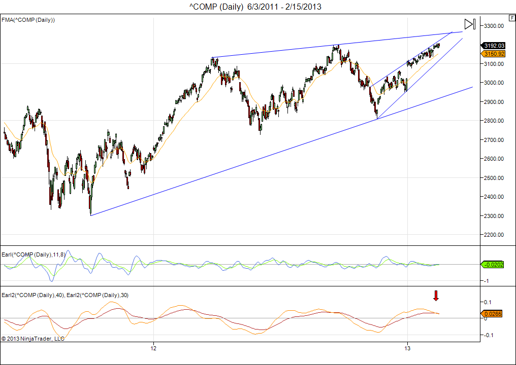
This market has reached our 3200 target, but seems to struggle to go higher, as we expected. I continue to look for a minor pullback in the next weeks and then another rally attempt in early March.
The Earl2 indicator is now clearly turning down. This means that any new highs we may see in the coming weeks, will be opportunities to sell and take profits. By the time the Earl2 bottoms out we will likely be able to buy at or below the current levels.
This means we should at least tighten our stops and be ready to get out as soon as a broader decline sets in.
Currently, a close below 3140 would be a strong indication to get out.
Today I also want to introduce something new, which I have been working on for a couple of months.
This is the “LT wave” chart (December through to March 2013):

The purpose of this wave chart is to spot shorter term moves (a few days) and to identify potential peaks and bottoms in advance. It also helps to estimate the strength or weakness of upcoming lunar red and green periods.
The lunar cycle is a major ingredient in this chart, but not the only ingredient. There is a “secret sauce”, so to speak.
So how to use it?
The orange line shows the daily signal, while the blue line is obtained by applying a 3 day smoothing filter, and the yellow line uses a 9 day smoothing. Values above 1 indicate strength, below 1 suggests weakness. I mostly use the blue line.
For this week the LT wave suggests weakness until Wednesday-Thursday, but Friday shows a strong upwards spike, which will be the peak value for February. In March we will get peak values on the 12th and 13th. If we get new highs on any of these days, then it are supposed to be good chances to take profits, or initiate positions to benefit from a downside move.
Let’s see how it pans out.
***
As chart of the week we take a look at the Euro vs US$ (click for larger image):

The Euro has dropped back from its recent peak, and my Earl2 indicator is turning down. The shorter Earl is well below zero, which means we are likely to get an upward bounce first, before turning down and fall further.
So, look for the Euro to hold up until well into March, then probably another leg down (and the Eurozone crisis back in the news)
Good luck,
Danny

Have you considered plotting the S&P on the LT chart?
Yes, of course that’s possible, and that’s what I have been doing for testing purposes.
For now, by the end of March we will be able to look back and see how well the wave chart has done by plotting the S&P or Nasdaq against it.
In my backtesting this LT wave produces 20% annualized gains for the last 60 years. This is by going long on days when orange line is above 1, selling short when it is below 1, using no leverage.
The question is how good is it in out of sample use. Time will tell us.
Danny
hi danny
we r in red moon now the market is going high please explain that. second thing the new lt wave is hard to point specific dates in it if u can add into it dates tnx :) roni
Hi Roni,
The red period is not over yet, so it is a bit early to tell.
But remember it is not rare for market to continue upwards in red periods. It means the market is strong.
Historically the red periods have gone up, but significantly less so than green periods. See the performance page: https://lunatictrader.wordpress.com/performance/
I have tweeted a new LT wave chart for you, now showing day by day more clearly (February and March).
See: http://t.co/kmfaQ0fQ
Danny
Hi Danny
I like your LT Wave chart, but how can you smooth something that must still happen?
regards
bob
Hi Bob,
The daily LT wave values for the orange line do not depend on any market data feed. They are calculated based on various cycles, moon phases and so on, and can thus be calculated for many years into the future already.
As you can see these values dance up and down a lot, so a smoothing filter is used to make it easier to see the short term trend.
E.g the blue line (3 day smoothing) just takes the orange value for 3 subsequent days, and averages them out.
So for the blue line to peak we need several days of positive values in the orange line.
Of course, this wave chart will not predict every move in the market, but it is working quite well already based on the observations I have done. I am still trying with other “ingredients” to make it even better.
Danny
Thank you